
Thursday, 8 May 2014
Wednesday, 23 April 2014


Thursday, 3 April 2014
Tuesday, 1 April 2014
Colour scheme
The colours that I have chosen to use are light colours to enhance the girlyness and to entice my target audience. I have used a light pastel pink as the background for the double page spread and contents and kept to using the same shade of purple and blue for the main parts of texts. I have used black where I needed the text to stand out against a busy background. I felt it was important to keep the colours the same and have a prominent house style though out.
camera issues and a learning curve
I took some images on a camera that I had not used before and when I went to look at my photos I realised that I had not focused the camera so my photos were all blurry and I couldn't use them. The owner of the camera then taught me how to focus the camera to obtain an image that wasn't blurred. I was then able to use this for my front cover.
Monday, 31 March 2014
Friday, 28 March 2014
Wednesday, 15 January 2014
Saturday, 4 January 2014

Magazine front cover

Monday, 9 December 2013
I have decided not to use either of the previous pictures that I took and posted on my blog, as I think the background of the photos are to busy and colourful and they detract from the subject. The colourful background also doesn't follow a specific colour scheme. I would like it to have an obvious colour scheme so when I retake my pictures I will create a planer background.
Thursday, 5 December 2013


Monday, 2 December 2013


risk assessment!
|
Risk ✖
|
How to avoid it ✔
|
|
The camera lights could fall and injure the model or
myself
|
Make sure all the lights cables are tucked away
|
|
The flash could blind the model
|
Make sure the lights re on a setting that is not to bright
|
|
The glittery make-up may have a reaction on their skin
|
I would do a small tester on her hand to make sure there
is no reaction, if there is ill wipe it of quickly.
|
Sunday, 1 December 2013

Wednesday, 20 November 2013
Mise en scene of an album cover
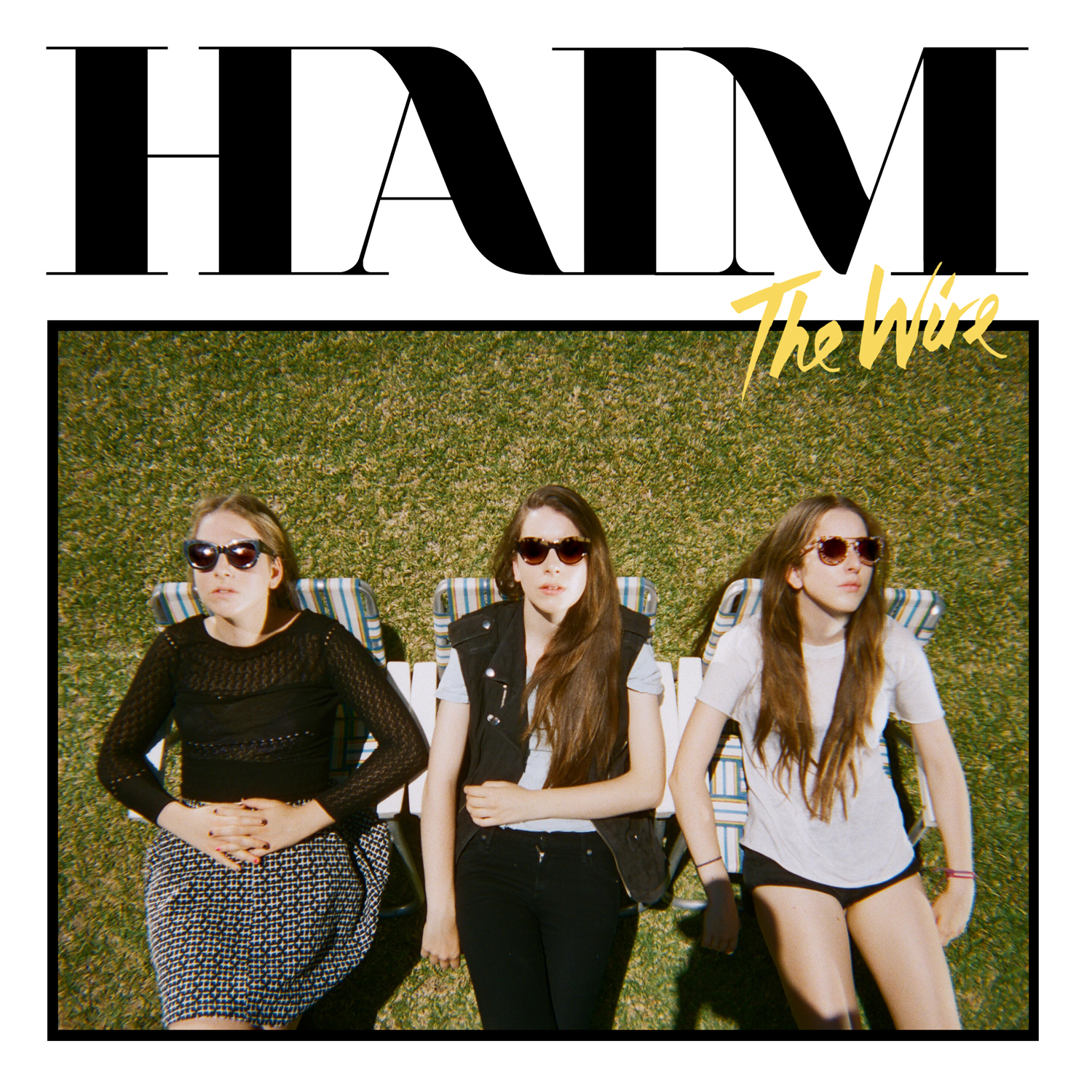
The image in this album cover has been taken to look like its outside on a sunny day which could have the connotations of nature or even festivals, which is the type of venue they would play at. The location isn't particularly glamorous.
They also are wearing quite summery clothes which are also quite dark and not very colourful. This could be seen as quite plain but stylish and looks more sophisticated than loads of really bright colours. They are not covered in sparkles or sequins or rind stones and are not showing a lot of flesh like other genres like pop or R&B would as they are selling their music and sound, they don't need to try and get attention by showing lots of their bodies in a provocative way. They wouldn't be attracting the type of audience that they would like to.


Tuesday, 19 November 2013
Photography studio
Photography studio
Today we had the opportunity to set up a photography studio
to take our photos! It was very different from working in the other places that
I have taken my photos for example outside, as we could get exactly the right
lighting which is something that can be very hard to achieve when working with
limited resources. With the lighting being so bright it really lightened up the
subject and meant that it would not have to be edited too much in a photo
editor and the image was of better quality.
We also had a plain
background which meant that on the front of a magazine the focus would stay on
the person in the picture rather than what is going on behind them, they would
not be distracted by a busy background. The images turned out very well and because
of the blank backdrop and they can be edited to fit the right mise en scene in
to the image on Photoshop if it was necessary.
I found the experience really useful to be able to learn how to create a really well planned out image which was well thought out, considering the placement of the model and where they were looking and the expression, and also the angle of the shot, weather it should be taken from a high level or low. I also learnt how to set up professional equipment which I can then teach to other people.
Friday, 15 November 2013
audience research conclusion
From my audience research i have decided that i am going to aim my magazine at girls and feature female artists as they seams to be more interested in a festival acoustic magazine more than boys would.
I asked a selection of boys and girls weather they would like a festival acoustic magazine and the result was that many of the girls would like this genre of magazine and they didn't think that were was anything like it already so they thought it would be a good thing to introduce it to the shelves.
On the other hand i didn't get a very positive reaction from the boys, they said they don't really listen to the kind of artist that would be featured in the magazine so they wouldn't really go out and buy it. They would just like it because of the attractive female artists.
This is why my magazine will have a more girly theme to it and may not feature as many male artists and it may be a bit more flowery and colourful.
Thursday, 14 November 2013

Wednesday, 13 November 2013
first draft letter
Yo festivalgoers and welcome to the first edition of Festival Gem! This magazine will quench your thirst for the freshest new up and coming female bands and single artists from the festival acoustic scene, like Haim, Foxes and Nina Nesbit Its full of sneak previews in to the crazy flower patterned lives of the top festival acoustic band right now! As well as intriguing interviews I am happy to show off the fact that we have our very own festival fashion guru, who is going to get you kitted out in the latest indie gear and create you in to your own Jem. I really hope you can set up camp in this wonderful campsite of magazine and enjoy the musical vibes from all the exciting articles we have to offer.
Molly!
Monday, 11 November 2013

Sunday, 10 November 2013
Friday, 8 November 2013


Wednesday, 6 November 2013
Friday, 25 October 2013
Monday, 21 October 2013


Initial research task
vFind out how many different music magazines are on the market. Briefly write about this.
vGenre research task- research what
genre is.
vHow many different genres are
there? Make a list of these, why not create a wordal?
vHow many sub-genres are the?
vComplete at least one magazine
deconstruction, like we did in class.
Fashion magazine deconstruction


I am aware that this is a fashion magazine but I decided to deconstruct it as I though that it has connotations of my festival acoustic genre, the pastel shades and way that it was written. It is also aimed at a similar audience to the audience I am aiming my magazine at and feature artists that I would include in my magazine. I have other deconstructions that are of music magazine as well to help me to see the conventions of music magazines as well.
Monday, 30 September 2013


Subscribe to:
Comments (Atom)